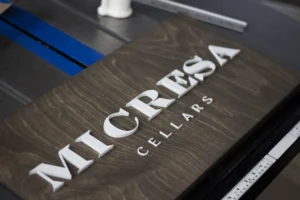
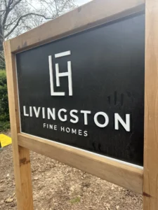
An art gallery sign has a harder brief than most business signage: it has to
be good enough to belong in a room full of art, and restrained enough that nobody looks at it
instead of the work.
Get that balance wrong in either direction and it shows. Too plain and it undercuts the space.
Too loud and it becomes the first thing in the room, which is the one thing a gallery sign must
never be.
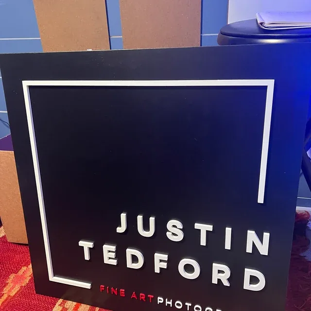
The project: ebony and white for a fine art space
A fine artist came to us for custom wood signage for their space. We built it
on an ebony base with white and red lettering.
Ebony is the right instinct for anywhere art hangs, and the reason is the same reason galleries
paint walls white or charcoal rather than beige. A neutral, low chroma surface gives the eye
nothing to argue with, so color in the room belongs to the work. Ebony reads almost black at a
distance and still shows grain up close, which keeps it from feeling like a printed panel.
White carries the legibility. The red is a single accent, used sparingly, which is exactly how
accent color should behave in an exhibition space sign.
What galleries, studios and exhibition spaces need from signage
- Low chroma. The sign should not introduce a color that competes with hung work.
- Matte over gloss. Galleries are lit with directional spots, and gloss creates
hotspots exactly where you do not want them. - Sized to support, not lead. Gallery signage is smaller than commercial
signage of the same wall size. - Material integrity. An audience that looks closely at objects will look
closely at your sign. - Repositionable, because exhibition layouts change.
Sizing gallery and studio signs by location
| Placement | Typical size | Notes |
|---|---|---|
| Gallery entrance or street facing | 36″ x 18″ to 48″ x 24″ | Needs to be read before someone commits to walking in |
| Interior feature or reception wall | 24″ x 18″ to 36″ x 24″ | Seen from across the room |
| Artist studio wall | 18″ x 12″ to 24″ x 18″ | Often the backdrop in studio photography |
| Exhibition or pop-up space | 24″ x 12″ to 36″ x 18″ | Portable, easy to rehang |
| Open plan or double height gallery | 48″ and up, to 60 inches | Large volumes swallow smaller signs |
The consistent mistake with an artist studio wall sign is going too large.
Commercial signage wants presence. Gallery signage wants to be found when looked for and ignored
otherwise, so drop one size from what you would order for an office of the same dimensions.
See sizes and stains for gallery signage
Frequently asked questions about art gallery signs
What is the best color for a gallery sign?
Neutral bases, ebony, dark walnut, natural or white wash, with a single high contrast lettering
color. Save the color for the art.
Will a wood sign look out of place in a white cube gallery?
Ebony and dark walnut sit comfortably in minimal spaces because they read as near black. White
wash works too. Warm mid stains are the ones that can feel rustic against white walls.
Can you cut a gallery sign to a custom shape?
Yes. Contour cut signs
follow the exact outline of your logo or wordmark rather than sitting on a rectangular panel.
How do I hang a sign without damaging a gallery wall?
Sawtooth hangers need one small fixing. For spaces where you cannot drill, ask about adhesive
backing or a hidden cleat at quote stage.
Can I get a matching smaller sign for art fairs?
Yes, and a batch costs less per sign than two separate orders.
See your gallery sign before you commit
Every order starts with a free digital proof so you can see your wordmark on
your chosen stain at the size we would recommend for the room. Handmade to order in California.
Related:
photography studio signs ·
boutique studio signs ·
music store signs