Beverage brands live on their labels. The mark has to survive being printed small on a bottle,
stacked on a shelf and seen from across a store, which means these logos are usually bold, high
contrast and built for impact.
That translates well to wood, and a beverage company sign is one of the few
cases where going heavier on the lettering is clearly the right call.
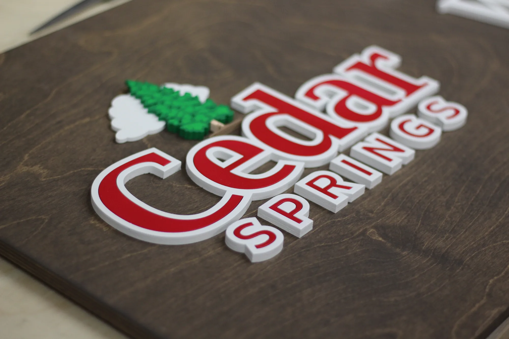
The project: thick lettering on dark walnut
A beverage company came to us with a script and block mark in red, white and green. We built it
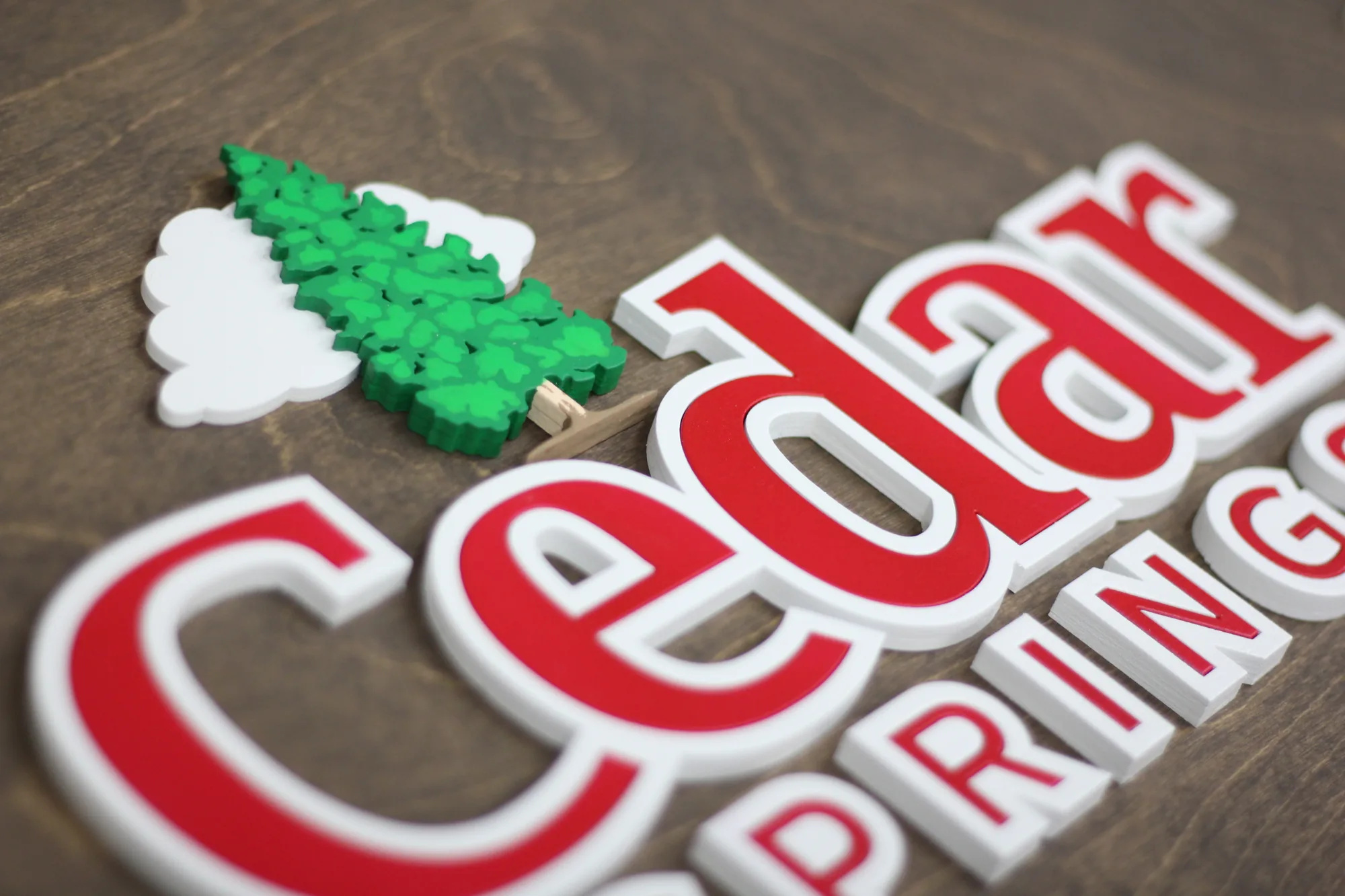
on dark walnut with noticeably thick lettering.
Look at the edge in the photograph. That thickness is a deliberate choice rather than a
by-product, and it changes how the sign behaves. Thin lettering casts a fine shadow line and reads
as elegant. Thick lettering casts a heavy shadow and reads as substantial, closer to cast metal or
moulded plastic signage than to something cut from a sheet.
For a brand whose identity is bold, that heft matches. On a delicate script it would be wrong.
The rule of thumb: match the physical weight of the sign to the visual weight of the logo.
How lettering build changes the result
| Build | Shadow line | Reads as | Best for |
|---|---|---|---|
| Engraved into the base | None | Flat, understated | Simple text, tight budgets |
| Standard cut lettering | Fine, crisp | Clean and modern | Most business logos |
| Thick cut lettering | Heavy, pronounced | Substantial, almost cast | Bold marks, drinks and food brands |
| Stacked multi layer | Multiple shadow lines | Real depth and hierarchy | Logos with inner and outer elements |
| Contour cut, no base | Shadow directly on the wall | Painted on, minimal | Strong silhouettes |
Depth is the only thing a wood sign offers that a printed one cannot, so it is worth deciding
deliberately rather than defaulting. A dimensional logo sign earns its price in
the shadow it casts.
See contour cut and layered signs
What beverage and drinks brands need
- Color accuracy. Label colors are recognisable and any drift is obvious.
- Impact at distance, which is what the brand is designed for anyway.
- Works in a production office and a tasting space, which are very different
rooms. - Photographs well, since drinks brands live on social imagery.
Frequently asked questions
Can you make the lettering thicker than standard?
Yes. Tell us at proof stage. Thicker stock costs a little more and gives a much heavier shadow.
Can you match our label colors?
Yes, hand mixed against your reference. For color critical brands, posting us a printed label
gives the closest result.
Can a sign like this go outdoors?
Yes, with an exterior clear coat. Allow extra time for cure between coats.
Can you do signs for both the office and a retail display?
Yes, and batch pricing makes it cheaper per sign than ordering separately.
How large can you build?
Up to 60 inches on the long side.
See your sign before you commit
Send your logo and we will return a free digital proof including a
recommendation on lettering thickness for your mark. Made in the USA.
Related:
restaurant signs ·
small food producer signs ·
winery tasting room signs