A therapy office sign is doing something no other business sign has to do. The
person reading it is often anxious, frequently there for the first time, and may have spent weeks
working up to walking through the door.
Everything in that waiting room is communicating whether this was a safe decision. The sign is
part of that, and it is one of the few parts you fully control.
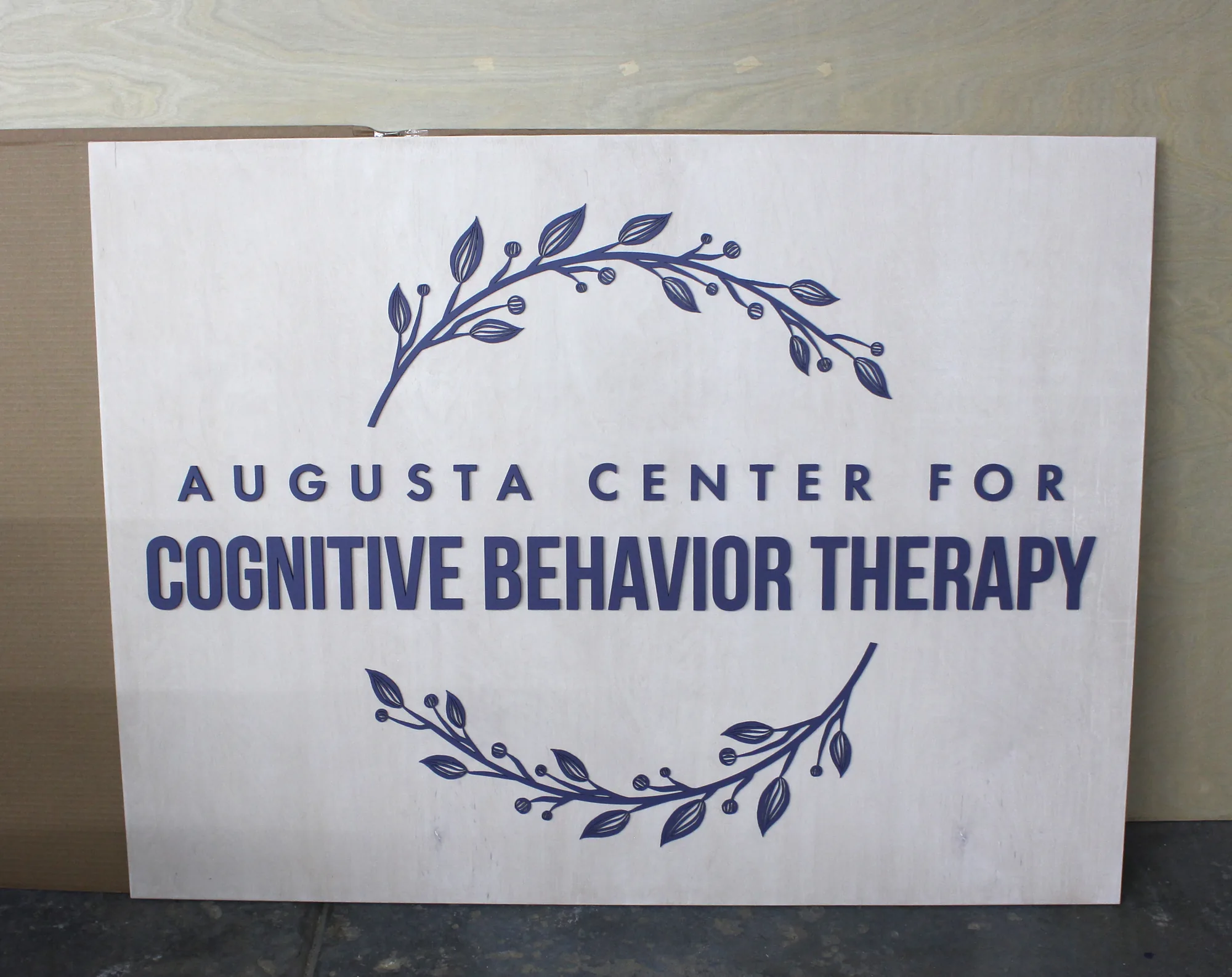
The project: white wash and purple
A CBT practice came to us for their space. White wash base, purple logo.
Purple is a harder color to place on wood than people expect. It has a lot of blue in it, and
warm stains fight that directly: on western oak or aged walnut the yellow in the timber drags a
clean purple toward brown and it loses its identity. White wash removes the warmth from the panel
so the purple stays true, while keeping enough grain that the sign still reads as wood rather than
as a painted board.
Light base, single soft color, no hard contrast anywhere. For a mental health practice
sign that combination does the right thing: it is legible without being assertive.

What counseling and mental health practices need
- Calm before clarity. Legible, yes, but never bold.
- Nothing clinical. Chrome, gloss and stark white read as medical, which is not
the message. - Nothing corporate either. Heavy dark stains and gold can feel like a law firm.
- Quiet in a small room. Most private practices are compact.
- Discreet exterior signage. Many clients value not being seen arriving.
Choosing a stain for a therapy waiting room
| Stain | How the room feels | Pair with |
|---|---|---|
| White wash | Open, light, unintimidating | Soft mid tones: purple, sage, dusty blue |
| Natural birch | Warm and neutral, very safe | Almost any color |
| Weathered gray | Calm and cool, slightly contemporary | White, soft blues, rose gold |
| Western oak | Warm and traditional | Cream, white, deep greens. Avoid cool purples and blues |
| Aged walnut | Grounded and settled | White, cream, metallics |
| Ebony | Formal, can feel heavy in a small room | White only, and only in larger spaces |
The rule that catches people out on a counseling office sign: cool logo
colors want cool bases. Purple, lavender, sage and dusty blue all shift and muddy against warm
timber, and no amount of paint quality fixes it. The base has to be right first.
Frequently asked questions about therapy office signs
What color sign is best for a therapy waiting room?
Light bases with a single soft accent color. Avoid high contrast and avoid anything glossy.
Will a purple or blue logo work on wood?
On a cool base, yes. On a warm stain it will shift toward brown. We will flag it on the proof if
your chosen combination is going to disappoint.
What size for a small private practice?
Most private therapy offices land between 18″ x 12″ and 24″ x 18″. These are small rooms and a
large sign dominates them.
Can I have something discreet for the building exterior?
Yes, with an exterior clear coat. Many practices choose a smaller, quieter exterior sign
deliberately.
How long does it take?
About a week for an interior sign. We send a free proof before anything is cut.
See your practice sign before you commit
Send your logo and we will return a free digital proof showing it on your
chosen stain, with an honest opinion on whether the colors will sit well together. Family run,
handmade in California.
Related:
counseling office signs ·
chiropractic office signs ·
wellness center signs