Wellness businesses sell calm. That is a harder brief for a sign than it sounds, because
calm is easy to make boring. The sign has to feel considered and premium without shouting, and
it has to survive being photographed by every client who likes their treatment.
The project
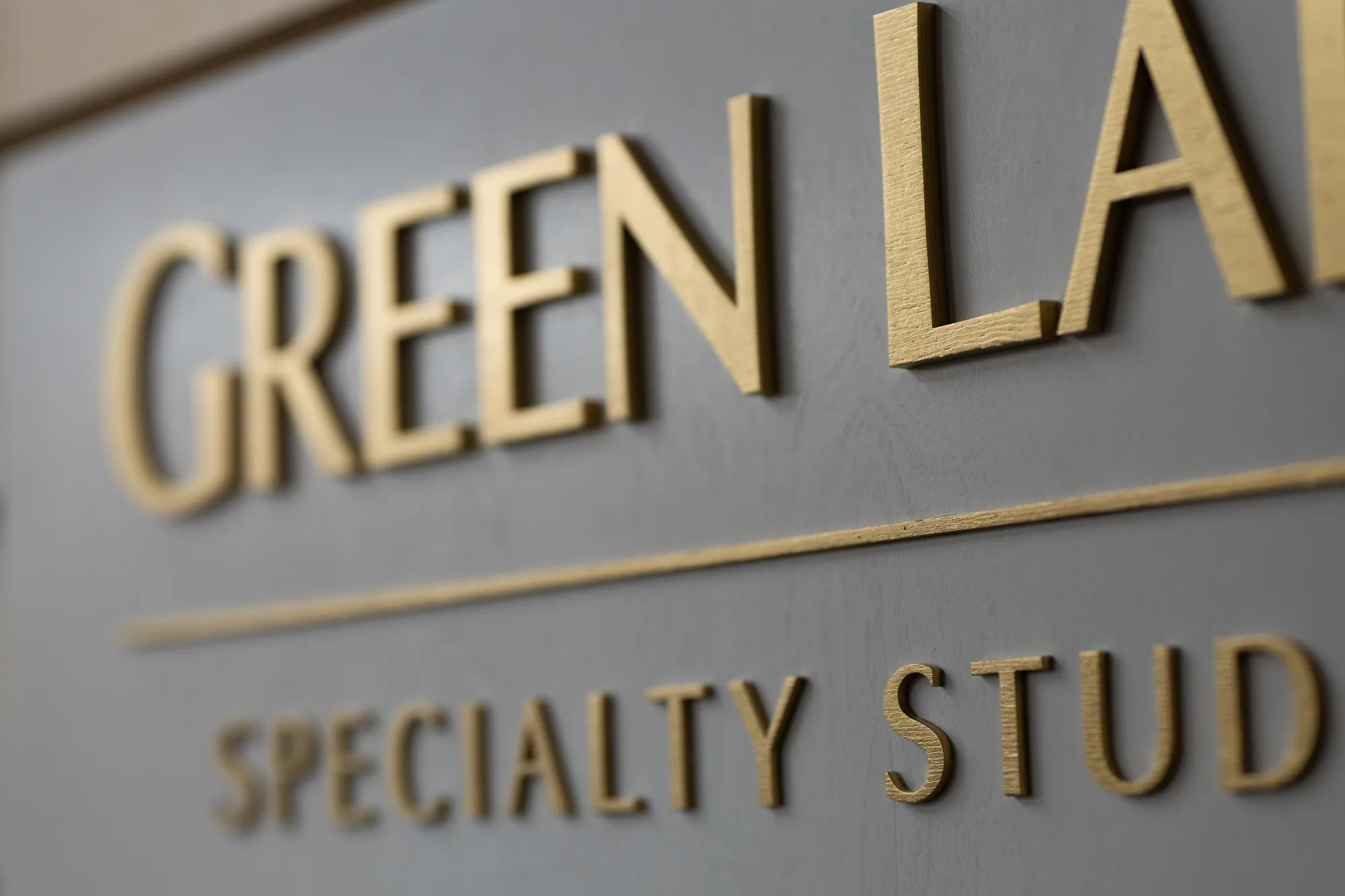
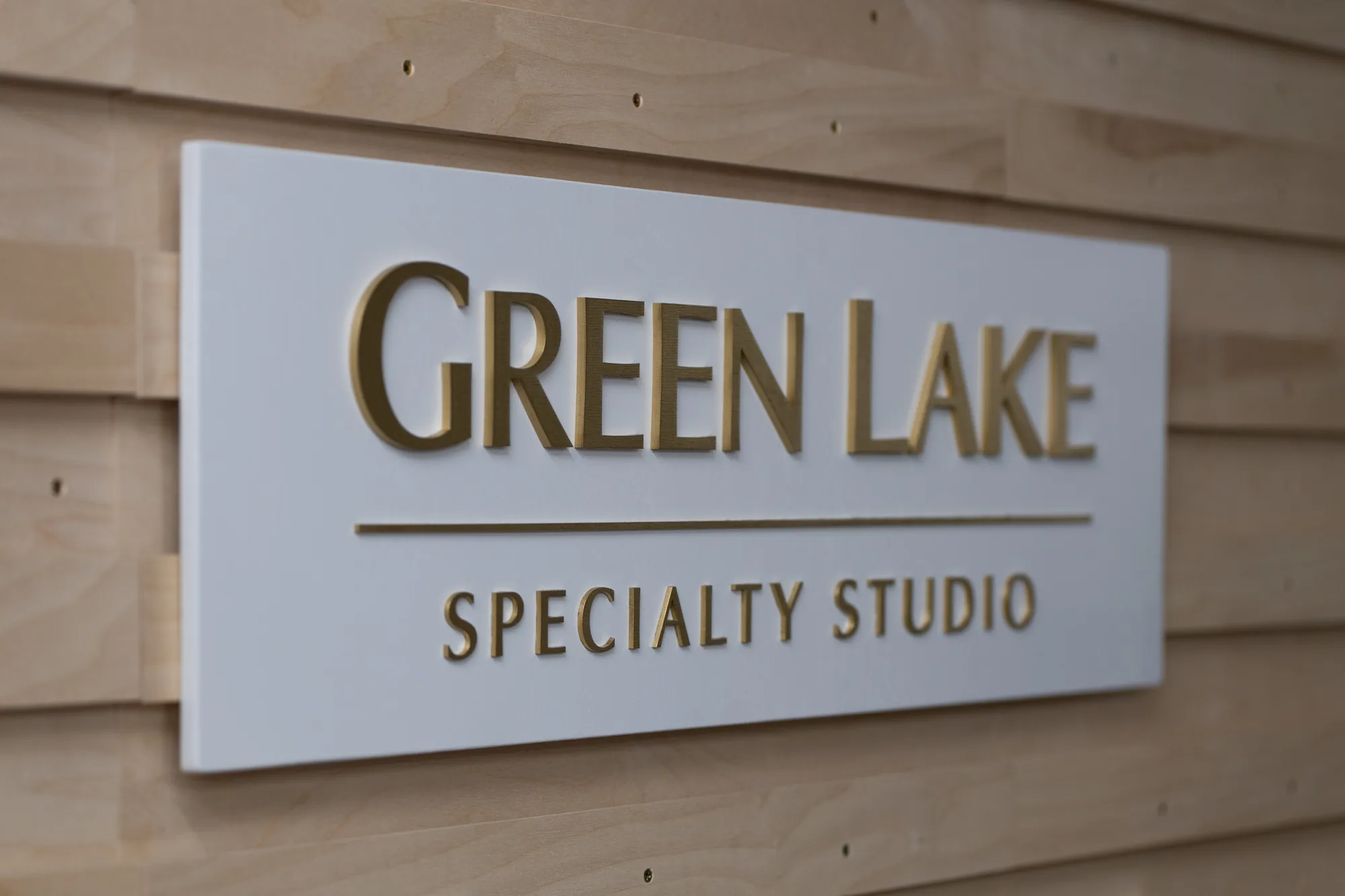
A wellness center came to us wanting gold on white. Simple to describe, and the sort of
combination that goes wrong easily. Gold is not a color in the way navy is a color. It is a
finish, and it only reads as gold when light hits it at an angle. Flat printed gold looks like
mustard. Metallic gold on a raised, cut letter catches light along its edges and reads as
actual metal.
That is the argument for dimensional lettering on any metallic logo. The depth is what makes
the finish work.
We painted the base white rather than staining it. Wellness interiors tend toward light
neutrals, and a white base lets the gold do all the work without the grain adding a rustic note
that would fight the room.
What wellness and spa spaces need from a sign
- Nothing loud. No backlighting, no gloss, no high contrast. The room is
doing a job and the sign should support it. - A finish that reads premium in low light. Treatment spaces are dim. Metallics
and mid stains hold up better than flat color. - Photographs well. Clients photograph these spaces constantly, which is free
marketing if the sign looks good on a phone camera. - Calm palette. One accent color is usually enough.
Working with metallics and multi color logos
| Logo finish | How it behaves | Works best |
|---|---|---|
| Metallic gold | Warm, shifts with the light, reads premium | On white, white wash or dark walnut |
| Metallic silver / gray | Cooler, more corporate | On ebony or natural |
| Rose gold | Soft, contemporary | On weathered grey or white |
| Flat white or black | Maximum contrast and legibility | Anywhere legibility matters most |
| Multiple custom colors | Each color is hand mixed to match your brand | Detailed or illustrative marks |
Every color in a logo is mixed by hand to match your brand, which is why a multi color mark
takes longer than a single color one. It is also why the match is closer than a stock
palette would give you.
Frequently asked questions
Will metallic gold look like plastic?
Not at this scale and depth. The cut edge is what sells it. Flat printed metallics look
painted, raised ones catch light and read as metal.
How many colors can a logo have?
As many as it needs. Each additional color adds hand mixing and masking time, so it does
affect the price, and the proof will show you exactly how it will look before anything is cut.
Can you match a specific gold from our brand guide?
Send the reference and we will get as close as a mixed metallic can. The proof stage is where
we agree it.
Interior only?
This build is interior. Add an exterior clear coat if the sign is going outside.
See yours before you commit
Every sign starts with a free digital proof, so you can see your logo on your
chosen base before we cut anything. Made by hand in California.
Related:
massage therapy signs ·
salon signs ·
health company office signs