There is an obvious reason handmade soap and skincare brands end up with wood signs. If your
whole proposition is that a person made this, by hand, from natural ingredients, then a printed
plastic sign quietly contradicts you every time someone looks at it.
Materials carry meaning. A customer who cares enough to read your ingredient list will notice
what your sign is made of.
The project
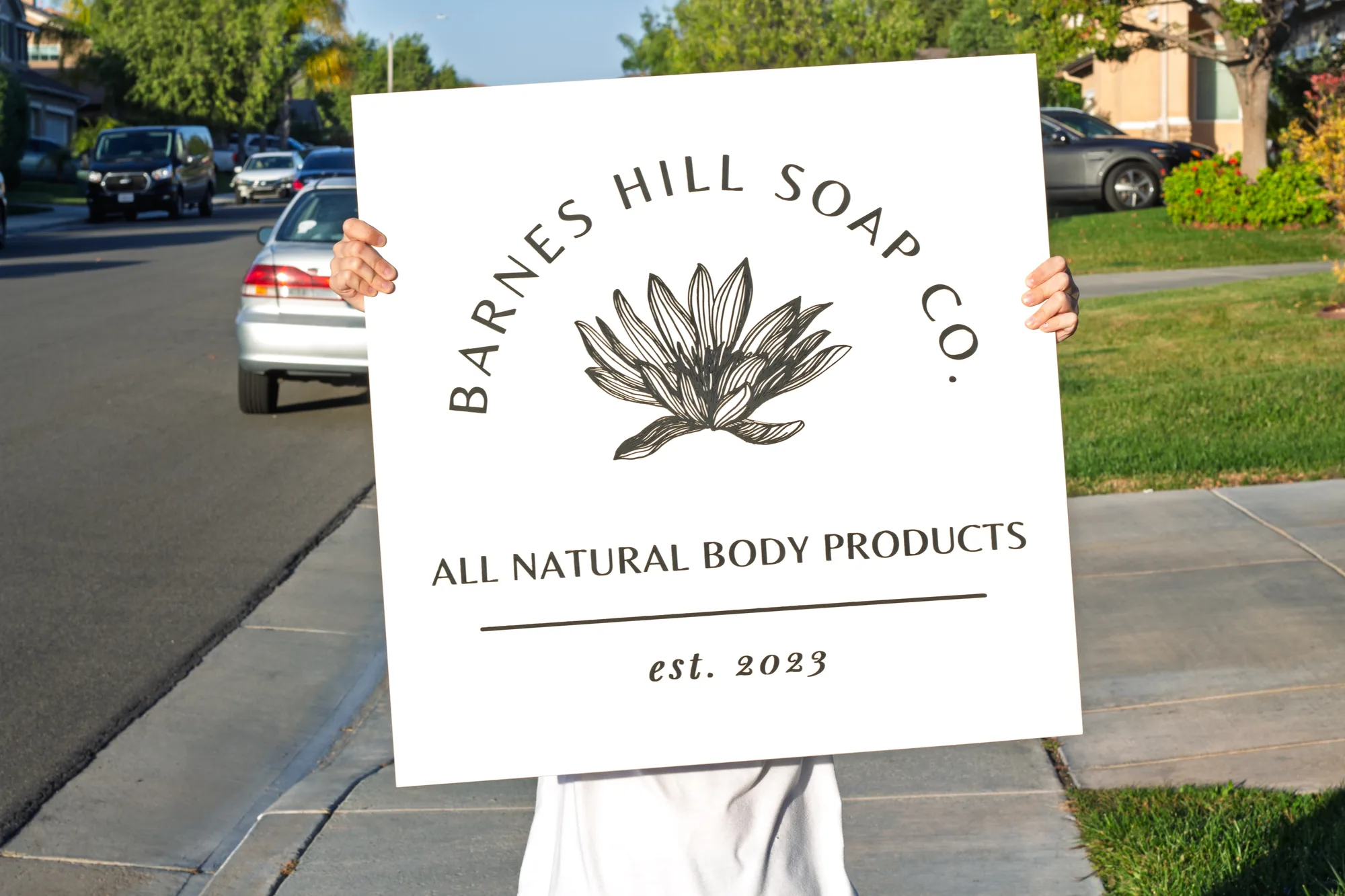
A natural bath and body maker came to us with a single color mark and a preference for
something light. We went with a white wash base and dark gray lettering.
White wash is a useful stain and an underrated one. It is not paint, so the grain still reads
clearly through it, which keeps the wood visible as wood. But it lifts the whole panel toward
the soft, clean palette that skincare brands live in. Natural birch on its own can feel too
yellow next to muted packaging. White wash cools it down without going flat.
Dark gray rather than black was deliberate. Black on a very light base is high contrast and
slightly severe. Gray holds the same legibility and lands softer, which suited the brand better.
What handmade and artisan brands need from a sign
- Material honesty. Real wood, visible grain. The sign should be made the same
way the product is. - A palette that flatters packaging. Your products get photographed in front
of it. A loud base fights them. - Portable. Makers do markets, fairs and pop-ups. Smaller sizes travel.
- Legible in daylight. Outdoor markets are bright and unforgiving, and low
contrast disappears in sun.
Getting your brand color right on wood
Color on wood behaves differently to color on paper or screen, and it is worth understanding
before you pick.
| Approach | What you get | Best when |
|---|---|---|
| Stained base, painted logo | Grain shows through the base, exact color on the mark | Most brands, and the usual answer |
| Painted base, painted logo | Two exact colors, no grain | Strict brand guidelines |
| Stained base, natural wood logo | Tone on tone, very subtle | Minimal brands, but check legibility first |
| Metallic logo | Shifts with the light, reads premium | Gift and luxury positioning |
| Multiple colors | Each hand mixed to match, masked and coated separately | Illustrative or detailed marks |
Every color is mixed by hand against your reference rather than picked from a stock set, so
the match is closer than a standard palette would give you. It also means a multi color mark
takes longer to build.
Frequently asked questions
Can you match a Pantone or hex value?
We mix to match your reference as closely as hand mixed paint allows. Send the value or a
printed sample and we will get close, and you will see it on the proof before we cut.
Will white wash yellow over time?
Indoors and out of direct sun, it holds up well. Strong sunlight ages any light finish faster
than a dark one.
Is a smaller sign worth it for market stalls?
Yes. Around 24 inches is the sweet spot for something you carry to events and still read from
across an aisle.
Can I get a matching smaller one for the studio?
Yes, and ordering both together costs less per sign than ordering them separately.
See yours before you commit
Every order starts with a free digital proof showing your logo on your chosen
stain at your chosen size. Handmade in California, one at a time, much like your soap.
Related:
small food producer signs ·
salon signs ·
wellness center signs