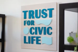
A pediatric office sign has to speak to two audiences standing in the same
room. The child needs the space to feel friendly. The parent needs it to feel competent. Lean too
far toward the child and you get a waiting room that worries parents. Lean too far the other way
and you get a clinic that frightens children.

The project: navy with an illustrated mark
A pediatric practice came to us with an illustrated logo, and we built it on a navy stained base
with white and colorful lettering.
Navy is the resolution to that two audience problem. It is a serious color, close to ebony in
weight from across a room, so the parent reads competence before they read anything else. But it
is unmistakably blue rather than black, which is warmer and softer, and it makes a perfect
backdrop for bright illustrated elements in a way that black never quite does. Bright colors on
black can look harsh. On navy they look intentional.
The illustrated part of the mark then carries all the friendliness, and because it sits against
a calm base it does not tip the room into a play area.

Choosing a stain for a children’s clinic
| Stain | What parents read | What children read | Verdict |
|---|---|---|---|
| Navy | Competent, calm | Friendly, colorful backdrop | The best of both, and hard to beat here |
| White wash | Clean, open | Bright and unintimidating | Excellent for smaller practices |
| Natural birch | Warm, neutral | Soft, unclinical | Very safe choice |
| Western oak | Traditional, warm | Cosy | Good, though can feel dated |
| Ebony | Serious, formal | Can read severe | Usually too heavy for pediatrics |
| Painted bright base | Can look like a play center | Fun | Risks undermining clinical confidence |
The pattern worth noticing: keep the base calm and let the logo carry the color. That way a
children’s clinic wall sign works for both audiences without compromising for
either.
What pediatric and family practices need
- Warmth that does not undercut competence.
- Durability at low height, because children touch things.
- Cleanable surfaces, which matters more in pediatrics than most settings.
- Readable to a parent from the door while they manage a child.
- Illustration handled properly, since many pediatric logos are drawn rather
than typeset.
Frequently asked questions
Can you cut an illustrated or drawn logo?
Yes. Fine detail sometimes needs slight thickening so it holds together and stays strong on the
wall. We show any adjustment on the proof before cutting.
Is navy better than black for a children’s clinic?
In our view yes. Same visual weight, warmer character, and a far better backdrop for bright
illustration.
Is a wood sign durable enough for a pediatric waiting room?
Yes, sealed surfaces handle wiping and handling. Mount above child height where you can.
Can we get matching signs for consulting rooms?
Yes, batch priced, and cheaper per sign than ordering separately.
How long does it take?
About a week for interior. Multi color marks take a little longer, as each color is applied
separately.
See your practice sign before you commit
Send your logo and we will return a free digital proof showing it on your
chosen stain at your chosen size. Family run, made by hand in California.
Related:
medical office lobby signs ·
kids name signs ·
therapy office signs