Massage practices have the opposite problem to most businesses. Almost everyone else wants
their sign to grab attention. You want yours to lower someone’s shoulders.
That is a real design constraint, and it rules out most of what the signage industry sells:
backlighting, gloss, high contrast, anything that looks like retail.
The project
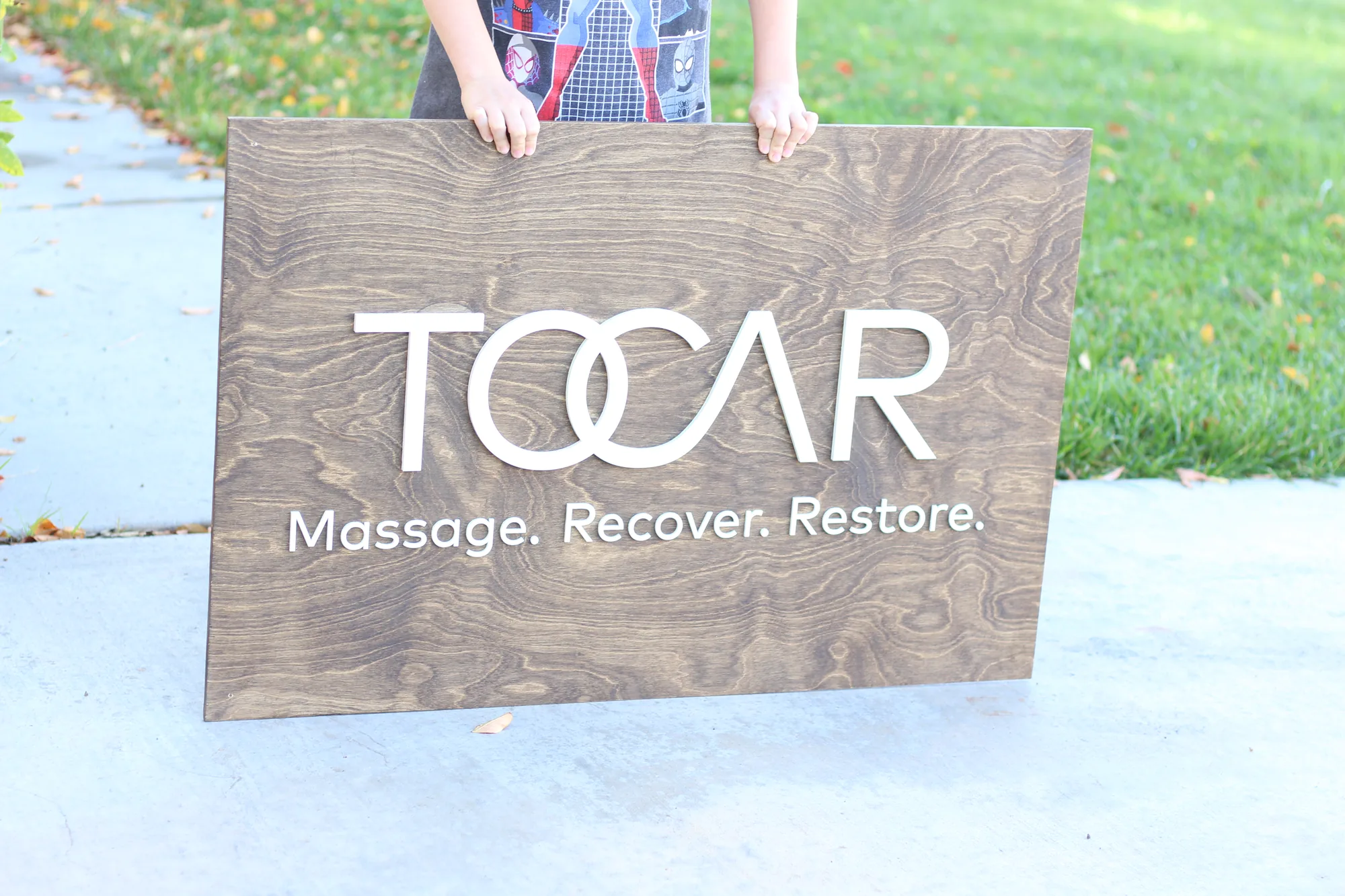
A massage practice came to us with a two color mark, white and a soft mint green, and a
space designed to feel restful. Aged walnut was the obvious base. It is warm without being
heavy, and it sits comfortably beside the timber, linen and plant tones that most treatment
spaces use.
The mint green is the interesting part. Soft colors have a habit of vanishing against mid
stains, particularly in the low, warm lighting these rooms use. Pairing it with white kept the
mark legible: white carries the shape at distance, the mint carries the character up close.
Mint on its own against walnut would have been pretty in daylight and invisible at six in the
evening.

What treatment spaces need from a sign
- Nothing that draws the eye hard. The sign is orientation, not advertising.
- Warm tones. Cool grays and chrome read clinical, which is the opposite of
what you are selling. - Works in low light. These rooms are deliberately dim.
- Matte, not gloss. Gloss picks up every light source and creates hotspots.
- Quiet materials. Wood, linen and stone belong. Acrylic and metal do not.
Picking a stain for a low light room
| Stain | In a dim room | Pair with |
|---|---|---|
| White wash | Stays bright, lifts a dark space | Dark or mid tone lettering |
| Natural | Neutral and warm, very forgiving | Almost anything |
| Western oak | Golden, gets warmer under bulbs | White, black, deep colors |
| Aged walnut | Warm mid tone, reads settled | White, cream, metallics, soft colors if paired with white |
| Dark walnut, ebony | Recedes, can go heavy in a small room | White or metallic only |
| Weathered gray | Cool and calm, can read cold | White, rose gold |
The rule that saves most people: the darker your base, the lighter your lettering needs to
be. Soft mid tone colors on mid tone stains is where legibility goes wrong.
Frequently asked questions
Will a pale brand color work on wood?
On a light base, yes. On a mid or dark stain, pair it with white or cream so the shape stays
readable. We will show you on the proof.
Is the finish matte?
Interior signs are finished to a low sheen rather than gloss, which suits treatment rooms.
How big for a treatment room versus reception?
Treatment rooms and hallways usually sit around 18 to 24 inches. Reception walls want 36 inches
or more, because you are seen from the doorway.
Can I have a smaller matching one for each room?
Yes, and a batch costs less per sign than ordering them one at a time.
See yours before you commit
We send a free digital proof so you can see the colors together on your
chosen stain before anything is cut. Turnaround is about a week for interior signs.
Related:
wellness center signs ·
therapy office signs ·
chiropractic office signs