Modern counseling and mental health brands use a lot of gradient. Soft blends from blue into
teal, sunrise oranges, layered circular marks that shift color across their width. These look
excellent on a website and present a genuine technical problem the moment you want one on a wall
in wood.
A counseling office sign with a gradient in it is a hand painting job, not a
cutting job.
The project: a gradient mark on white wash
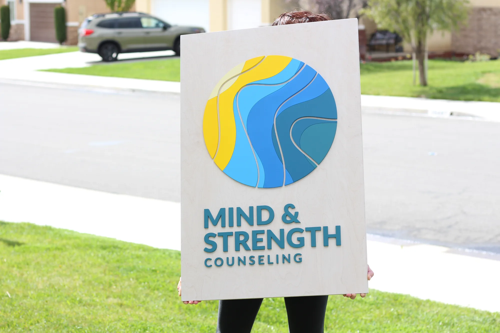
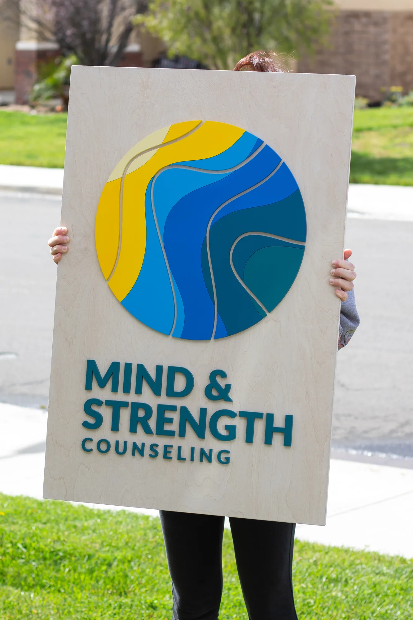
A counseling practice came to us with a circular logo that blends through blue, teal and yellow
across its width. We built it on a white wash base.
Laser cutting does not produce gradients. It cuts shapes, and each shape gets a color. So a
blend has to be created afterwards, by hand, painted across the cut pieces so the transition runs
continuously through the mark rather than stepping between flat bands.
That is slow, careful work and it is the single most time consuming thing we do. It is also the
only way to get a gradient logo wood sign that actually matches the brand rather
than approximating it with two or three separate flat colors.
White wash was the necessary base. A gradient carries a lot of visual information, and any stain
with real character underneath it competes and muddies the transition. The quietest base wins.
How multi tone and blended logos are handled
| Logo treatment | How it is built | Effect on time and cost |
|---|---|---|
| Single flat color | One mix, one pass | Fastest |
| Several flat colors | Each mixed, masked and applied in turn | Adds time per color |
| Two tone stepped blend | Two colors on separate cut pieces | Modest addition. A good compromise |
| True gradient | Hand painted blend across the pieces | The slowest element of any build |
| Metallic plus gradient | Hand blended metallics | Slowest of all, and stunning when it works |
If budget matters, a stepped two tone version of a gradient often reads almost identically on a
wall at normal viewing distance. We will show you both on the proof and let you decide, rather than
quietly charging for the harder option.
What counseling practices need from a sign
- Calm before clarity. Legible without being assertive.
- Neither clinical nor corporate. Avoid chrome, gloss and heavy dark stains.
- Proportionate to a small room. Most private practices are compact.
- Discretion outside. Many clients value arriving unnoticed.
- Color accuracy, since these brands are usually carefully designed.
Frequently asked questions
Can you put a gradient into a wood sign?
Yes, painted by hand across the cut pieces. It is the slowest thing we do and the only way to get a
true blend.
Is there a cheaper way to get the same look?
A stepped two tone version often reads nearly the same from across a room. We will show you both.
What base works under a colorful logo?
White wash or natural. Anything more characterful competes with the blend.
What size for a private counseling office?
Most land between 18″ x 12″ and 24″ x 18″. These are small rooms.
How long does a gradient sign take?
Longer than a flat color build. Allow extra time and we will give you a realistic date at proof
stage.
See your practice sign before you commit
Send your logo and we will return a free digital proof, with an honest view on
whether a true gradient or a stepped blend will serve you better. Family run, handmade in
California.
Related:
therapy office signs ·
wellness center signs ·
nonprofit office signs